8 Red Flags in Your Design File That Could Ruin a Print Job
Posted on 25 November 2025

You think your design is perfect, the logo placement is balanced, the colours look vivid on screen, and the team is excited to see it printed. But when it reaches production, a small oversight in the file can unravel everything. Delays. Blurry prints. Colours that look off.
At R&P Prints Canada, we've seen every kind of design file disaster imaginable, and we've built systems to prevent them. From schools and sports teams to businesses across Canada, our clients rely on us to make sure every print looks as good in person as it did in their imagination.
Here are eight design red flags that can quietly ruin your print job, and how to make sure they never do.
1. Bleed, Trim, and Safe Zone Errors
Few things are more frustrating than seeing your artwork trimmed too close or a sliver of white creeping along the edge of your design. These are classic bleed and safe-zone issues, small technical missteps with big visual consequences.
A proper bleed extends your background colour or design slightly beyond the trim edge, ensuring no unintended borders appear after cutting. The trim line is where your file will be cut, and the safe zone is the area inside that line where important text or logos should live. Forgetting to extend bleed or respect margins risks cutting into your design or leaving awkward white edges.
As Carleton University's Print Shop explains, bleed allows colours and images to reach the very edge of the page by extending the artwork an extra 0.125 inches (⅛ inch) on all sides. Programs like Adobe Illustrator and InDesign make this easy to set up, but Word and Canva users need to increase their overall page size manually or extend background elements beyond the border to prevent unwanted white edges. The key is always the same: plan your bleed and keep important elements at least 0.25 inches inside the margin.
At Prints Canada, every artwork file is reviewed against proper bleed and trim standards before printing begins. We make sure what you see on screen is what you get in fabric form, clean to the edge and free from surprises.
2. File Format and Export Mistakes
Design programs can be deceiving. What looks flawless on your monitor might not translate to a printer's workflow. Many print issues begin with simple export mistakes, such as saving in RGB instead of CMYK, sending a JPG instead of a print-ready PDF, or forgetting to embed fonts and linked images.
These errors can scramble layouts, blur graphics, or completely change how colours appear. Printers typically prefer vector files or PDF/X exports, which preserve the integrity of both images and text.
At R&P Prints Canada, we use a print file setup guide to ensure every file arrives press-ready. If a format looks suspicious, we catch it early, adjusting compression, flattening transparencies, and confirming embedded assets. This behind-the-scenes care saves our clients from time-consuming corrections and costly reprints.
3. Font and Text Handling Problems
Typography can make or break a print job. You can have the most creative layout in the world, but if your text disappears, shifts, or prints unevenly, the entire design suffers.
One of the most common culprits is missing fonts. When a printer doesn't have access to your typeface, it substitutes another, often with disastrous results. Other errors include white text set to overprint, causing it to vanish on darker backgrounds, hairline fonts that fade under ink, or tiny captions that blur on fabric.
Our team ensures every font is either outlined or embedded correctly, spacing is clean, and sizing is suitable for your chosen print method, whether that's bold lettering on custom embroidered apparel or fine detail in a promotional shirt. We safeguard your typography so your message stays sharp and consistent from screen to shirt.
4. Image Resolution Issues
Low-resolution images are the silent killer of great designs. They look fine on a backlit screen but turn fuzzy and pixelated in print. Web graphics are often only 72 ppi (pixels per inch), while professional printing requires 300 ppi for sharp results.
As noted by Western University's Schulich School of Medicine & Dentistry, upscaling a small web image doesn't add quality, it just stretches existing pixels, making the image appear rough or blurry. The more you enlarge it, the worse it looks.
That's why our team checks every file for proper resolution and scaling before printing begins. If an image falls short, we catch it early, ensuring your final print is crisp, detailed, and vibrant, not soft or pixelated.
5. Incorrect Colour Mode Usage
Colour is emotional; it's what makes your design sing. But if your file is built in the wrong colour mode, it won't sound the same on fabric.
Digital screens use RGB, red, green, and blue, because those are the three wavelengths our eyes perceive directly. As physicist Dr. Christopher S. Baird explains, the human eye contains cone cells that detect red, green, and blue light, and together they allow us to see millions of colours through additive mixing. Computer screens and digital devices reproduce colour by adding light, so combining red and green light makes yellow, and all three primaries together make white.
Printing, however, uses a subtractive system. Rather than adding light, inks and dyes absorb it. The primary inks, cyan, magenta, and yellow (CMY), work by subtracting specific wavelengths from white light, leaving the desired colour to reflect. Cyan absorbs red, magenta absorbs green, and yellow absorbs blue. Mixing these three pigments produces nearly the full visible spectrum on paper or fabric. That's why designs that glow on screen in RGB can appear muted or dull when printed in CMYK, the two systems physically create colour in opposite ways.
To preserve vibrancy, always design in CMYK and apply ICC profiles that match your printer's setup. R&P Prints Canada reviews every file for colour accuracy, providing feedback if hues fall outside printable ranges. Whether you're ordering screen printing or DTG printing Canada, our calibrated process ensures your artwork stays vivid, true, and on brand.
6. Overcomplicated or Inconsistent Design Elements
Design complexity doesn't always equal impact. When there are too many gradients, shadows, or textures fighting for attention, the printing process can struggle to interpret your vision.
Layer-heavy files often flatten unpredictably, creating strange artifacts or colour shifts. Excessive fonts, inconsistent alignments, and heavy effects can also dilute your message. Clean design, on the other hand, amplifies clarity and prints beautifully across every method and fabric type.
Our artwork requirements emphasize simplicity and technical precision, the kind of balance that translates seamlessly from concept to print. We've helped countless clients refine overdesigned files without losing their creative edge. The focus is always on composition, readability, and visual harmony. The result is a design that prints as powerfully as it looks on your screen.
7. Proofreading and Review Oversights
A single typo or misplaced apostrophe can turn a perfect print into an expensive mistake. Yet proofreading remains one of the most skipped steps in design preparation.
Errors like misspelled team names, incorrect dates, or misaligned text layers happen when projects are rushed. Once your file is printed, those mistakes are permanent, and reprints cost far more than a five-minute review.
At R&P Prints Canada, we always provide a digital proof before production. Clients can double-check spelling, placement, and colours before approving the job. That final look ensures the design you approve is exactly the one that gets printed every time.
8. File Setup Ignorance (Wrong Templates, Scale, or Garment Mismatch)
Not all garments or printing methods are created equal. Designing for a poster or brochure is one thing; designing for a curved sleeve, textured hoodie, or zip-front jacket is another.
Using the wrong template or misjudging scale can distort artwork or cause it to print unevenly. Elements might fall too close to seams or fold into zippers, ruining the layout. As noted in the Government of Canada's customer guide to quality printing, every file must be sized and formatted according to the material being printed to ensure precision and quality.
Before production, our team verifies that every file matches its intended use, the right scale, orientation, and garment type. Whether you're ordering Toronto custom printing or large-batch promotional apparel, we ensure your design fits perfectly. It's part of our artwork requirements process, a built-in safety net that protects your vision from technical surprises.
Why These Red Flags Matter
Every one of these issues, from missing bleed to low-res images, can delay your order, waste materials, or compromise your brand's image. File precision isn't just a technical requirement; it's a reflection of professionalism.
That's why R&P Prints Canada's expert eye for detail matters. Our print specialists review every submission, correct small errors before they escalate, and communicate clearly so you know exactly what's needed. By the time your order goes into production, your file is optimized for sharpness, colour accuracy, and flawless placement. 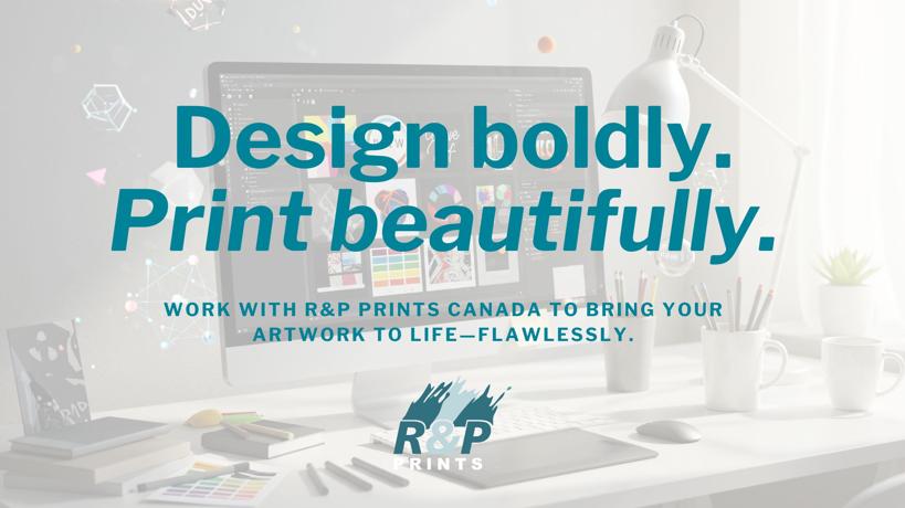
R&P Prints Canada's Promise: Precision Without Panic
You don't have to be a designer to get professional results. We've built our process around making sure your artwork performs beautifully in print, with no stress and no guessing.
- Print-Ready Assurance means we double-check every technical requirement before printing
- Seamless Process means you're guided through setup, review, and delivery with total confidence
- High-Quality Results mean your prints are bold, detailed, and long-lasting.
And because we're a Canadian printing company trusted nationwide, you get expertise backed by real human support.
Schools, teams, and organizations across Canada choose R&P Prints Canada for one simple reason: we care about the details that others miss.
Final Checklist Before You Hit “Send”
- Follow the print file setup guide carefully.
- Maintain proper bleed and safe zones.
- Work in CMYK, not RGB.
- Use 300 dpi images or vector graphics.
- Embed or outline all fonts.
- Flatten transparent layers.
- Proofread everything
- Confirm scale and placement.
These small steps can prevent big setbacks and keep your brand looking professional in every print.
Start Your Design With Confidence
Designing for print isn't about perfection, it's about preparation. Every pixel, colour, and line plays a part in how your brand is perceived.
When you start your design with R&P Prints Canada, you're working with a team that knows how to turn great concepts into perfect prints. Whether you need screen printing, embroidery, or custom T-shirt printing Canada, we'll ensure your artwork translates flawlessly from screen to fabric.
If you're ready to print with confidence, reach out to our team today. Let's make your next project stress-free, striking, and unmistakably yours.