Branding And Colour: The Psychology Behind Your Logo
Posted on 19 June 2018

Picture this: you’re driving down the street looking for a place to eat when you spot two restaurants in the distance, one of them has a brown and yellow logo, and the other one has a green logo. Which would you guess was the healthy restaurant? And which would you guess was the home-cooking restaurant? You’d have to concede that the green one is likely the healthy one, and the brown and yellow restaurant might serve burgers and fries.
This is a straightforward example of what is, in fact, a complex and sometimes divisive area of marketing – colour theory. Now, in our example, the colours almost directly correspond to the products sold (green salads, and brown and red burgers) but more often in the realm of marketing you’ll find colour theory as it corresponds to emotions, cultural associations, preferences and other intangible connections. This is all to say that when you create your logo and come into R&P Prints for custom t shirt printing in Toronto the colour you choose could greatly affect people’s perception of your brand.
In Satyendra Singh’s 2006 book Impact Of Color On Marketing, he determines that 62-90% of people’s assessments of brands are based on colour alone, and that colours not only serve to differentiate businesses, but also to affect the mood and feelings of consumers. Through his studies he found that colours were able to “increase or decrease appetite, enhance mood, calm down customers, and, reduce perception of waiting time”, among other things. That’s pretty astounding, considering it’s a facet of marketing that a lot of people don’t even think of. In the spirit of colour theory, then, let’s look at a few common colours, and what they evoke or represent.
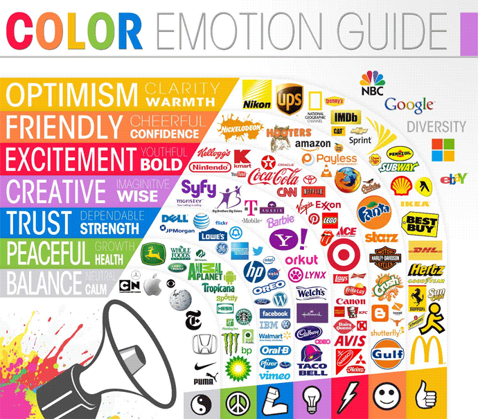
Red is a colour you see often in logos – Coca Cola, Netflix, McDonald’s and YouTube, all giant corporations that have opted to go the red route. It is a bold, excited colour that conveys energy and passion. Run a little thought experiment in your head: try and picture the Apple symbol in red, and think about how that changes its meaning. Apple is known for its steely, calm silver-grey logo, a beacon of tranquility and effortless grace, and changing it to red would upset that branding. In other words, if you own a yoga studio in Montreal, and are looking for the best custom t shirts Montreal has to offer to promote your business, don’t go for one of our red shirts!

Instead, maybe go with blue, which is a cool, peaceful colour. It often sells a sense of trust and dependability as well, which is probably why three of the biggest social media sites – Facebook, Twitter and LinkedIn – use it as their colour. Yellow is a bright, sunny, optimistic colour; you’ll see it on brands like Sun Chips, National Geographic, Nikon and Ikea, where it conveys a sense of youthful optimism. Green, as mentioned, is often used to reinforce the idea of growth and health – some companies like Whole Foods do this to market their healthy products, whereas, it must be said, some companies like BP do it to cover up the less healthy effects of their business practices.
When you go to get your custom t shirt printing done, consider how the colour of the logo and the colour of the shirt could effect people’s perception of your brand. Think of it as yet another tool you can use to make your marketing as strong and effective as possible.
