Get Inspired with These Iconic Toronto Logos
Posted on 22 January 2019

Across Canada, Toronto is known for its unique identity, diversity, and the strong personalities of Torontonians. The city also gets its fair share of criticism from Canadians in all parts of the country, so much so that a 2007 documentary called “Let’s All Hate Toronto” followed one person’s mission to explore why and where Canadians resent the city otherwise known as T-Dot.
![]()
At R&P Prints, we are proud to be your experts for custom t-shirts in Toronto for whatever occasion you need. There’s really no end to the opportunities to make custom clothing and we’re ready to create clothing to accommodate all sorts of occasions. Regardless of the opinion of Toronto, the truth is that the city has produced some iconic imagery that you can integrate into your own designs.
Where Can the Designs Go?
Think of a university intramural league that puts a spin on the Raptors logo, or a journalism conference with t-shirts that pay homage to the TTC logo. You could be making custom hoodies in Toronto or personalized toques for the winter, but still, you can always use a little inspiration for your items.
Good-looking, memorable design can make such an impact on how your organization is perceived and how you build your image. In the day and age where branding is more important than ever, having the correct positioning and sizing for your designs is essential.
We offer our screen printing and embroidery services in Toronto through our reliable online store making it simple to place an order. To get your creative juices flowing, here are some iconic Torontonian logos for your consideration.
The Toronto Maple Leafs
The team has a retro logo that inspires nostalgia (and fonder memories of times when they were winning) in whoever looks upon it. The Leafs are known for disappointing their fans but even so, their logo is everywhere—it’s memorable, clean, and has a distinct blue colour.
The Toronto Blue Jays
Another distinct blue colour, the Blue Jays’ logo has undergone some changes throughout its time but it’s still unignorably a symbol of the city. The distinct lettering could hardly be mistaken for anything else and the logo makes good use of contrast with a little bit of red colour for a pop.
TD Bank
Brighter clothing tends to grab people’s attention so why not use colour with your designs and even your fabric choice? The TD Bank “Green Machine” logo is one example of how much of an impact colour can have on a design. The two-letter logo of TD Bank also speaks to the importance of simplicity, which you can use as a lesson as you create your own designs.
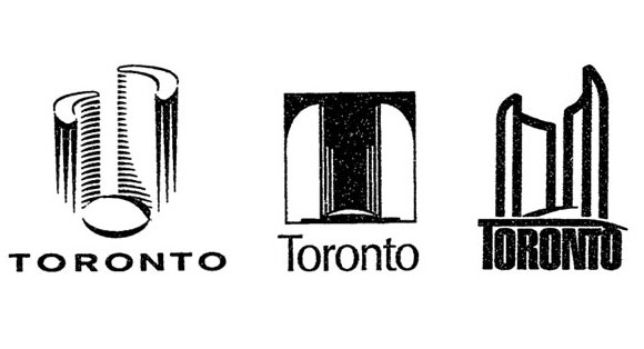
Also, take colour into consideration for the theme and purpose of your clothing. The Toronto city logo is simple and monochromatic to convey professionalism. Choose colours for your clothing that match the mood of your organization, event, or team and you can’t go wrong.
