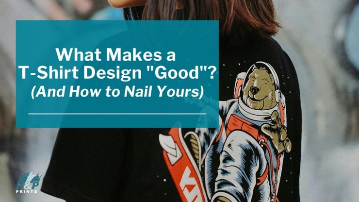
What Makes a T-Shirt Design "Good"? (And How to Nail Yours)
Posted on 30 September 2025
A good t-shirt design feels effortless. You look at it and it just works. But getting to that point—where something looks simple, clean, and appealing—actually takes a lot of thought. There's more going on behind the scenes than most people realize. If you're working with a local provider offering printing services in Toronto and Canada-wide, or looking to order internationally online, the same rules apply: From corporate gifts to branded apparel for your school, the goal is to make something people actually want to wear.
Businesses, schools, non-profits, influencers and fashion professionals are seeing the benefits. The custom t-shirt printing segment is experiencing significant expansion. Valued at USD$5.16 billion in 2024, it's expected to grow at a compound annual growth rate (CAGR) of 11.5% from 2025 to 2030.
Design Elements that Get the Right Reaction
Every strong t-shirt design is built on a few key elements working together. These include typography, imagery, colour, layout, and negative space. You don't need to use all of them in every design, but you do need to think about how the ones you do use are functioning. Are they clear? Are they balanced? Are they doing what you want them to do?
Typography is a big one, especially for text-based designs. The font you choose sets the tone. Bold sans-serifs feel modern and direct, while scripts and serif fonts can feel more expressive or vintage. The important part is legibility—if someone has to squint to read your shirt, they won't bother. Size, spacing, and alignment all play a role here too.
Imagery can range from hand-drawn illustrations to photo-based graphics to abstract shapes. Whatever the style, the image should feel intentional. Random clip art or overused icons tend to look generic, especially when printed. On the other hand, original art—even if it's simple—can make a shirt feel special and worth keeping.
Colour isn't just about what looks nice. It's about contrast, mood, and how ink will actually show up on fabric. Some colours pop against a white tee but get lost on black. Others might look great on screen but print poorly. Keeping your colour palette tight isn't just a design move—it can also save costs when you're ordering high-quality bulk t-shirt printing for events, giveaways, or merch drops.
Layout is all about flow. Where does the eye go first? Where does it go next? A centred design can feel classic and safe, while an off-center or pocket-sized design might feel more subtle or fashion-forward. The point is to make sure the design doesn't feel awkward or cluttered, no matter where it sits on the shirt.
Negative space—the space around and between your elements—is what gives the design room to breathe. Cramming everything into one spot usually makes things feel noisy and unprofessional. A little space can do a lot for clarity and style.
Visual elements play a crucial role in consumer preferences. Consumers often prefer products that are easier to process and understand visually.
When these elements are chosen with care and used with purpose, you end up with something that feels cohesive. Not just a collection of parts, but a design that makes sense on a shirt—and looks good doing it.
Custom Screen Prints for Graphic Tees
When you want your design to really land, screen printing is still one of the best methods out there, especially for bold, graphic tees. It's reliable, versatile, and produces prints that last. But to get the most out of it, your design has to be set up with screen printing in mind. That's especially true if you're creating custom apparel for brand visibility. Think teams, pop-ups, or company swag that need to make an impression right away.
The first thing to know is that screen printing works by applying layers of ink through mesh screens, one colour at a time. That means the number of colours in your design directly affects the production process. Fewer colours usually mean a lower cost and a cleaner, more impactful look. That's why so many classic graphic tees rely on high-contrast palettes or just one or two bold colours.
More Reasons Why Screen Prints are Everywhere
Custom screen prints also shine when the artwork is crisp. Clean lines and solid shapes come through beautifully. Intricate shading or full gradients can be done, but they require more setup and may not print exactly as they appear on screen. If you're aiming for fine detail, it's a good idea to work with a printer who can walk you through what's possible and suggest tweaks if needed.
Another key detail: fabric matters. The type of shirt you choose affects how the ink settles, stretches, or fades over time. Softer blends might give you a vintage feel, while heavier cotton holds bright prints well and gives that classic t-shirt structure. A good printer can help you match your design to the right garment to get the effect you want. Whether you're printing branded hoodies and sweatshirts or lightweight tees, the garment you choose should support both the print quality and your brand aesthetic.
Custom screen printing is all about balance between your creative vision and the technical side of printing. When it's done right, you get a design that looks sharp, holds up over time, and feels just as good to wear as it does to look at.
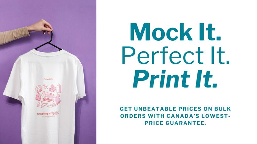
T-shirt mockups
At R&P Prints Canada, we always recommend using mockups as part of the design process. They're one of the best tools for making sure your graphic tee turns out the way you imagined. Before anything goes to print, a mockup gives you a chance to catch issues with layout, size, and placement—all without committing to a full production run.
Mockups let you see how your design will actually look on a shirt. Not just as a flat image, but on fabric, with folds, lighting, and real-world context. It's a quick way to make sure everything feels balanced, readable, and visually appealing. You might realize the graphic looks too small once it's placed, or that the colours blend into the shirt fabric more than expected. These are the kinds of details that mockups help bring to light early. It's also a chance to evaluate placement for additional touches like custom embroidery for logos and slogans, especially if you're mixing print and stitched elements for a more premium look.
If you're working with us, we can help you create professional, high-resolution mockups as part of your custom screen printing order. That means you'll be able to preview your design on the specific style and colour of shirt you're ordering. It also makes it easier to get sign-off from your team or share a preview with your audience if you're launching a campaign or pre-sale.
Even if you're still finalizing your design, using mockups during the planning stage can give you clarity. You'll get a better sense of what works—and what doesn't—before any ink hits the fabric. It's a simple step, but one that can make a huge difference in how your finished t-shirt turns out.
Let's make your next shirt your best one yet.
From branded hoodies to custom apparel for brand visibility, R&P Prints Canada offers full-service printing, with free shipping, across Canada. We also ship internationally below market rates. Contact us today to start your order or request a free quote!